
Design and branding
People decide whether they trust a company long before they read a paragraph. Slanfor designs logos, identity systems, and the screens of websites and apps so the look holds together. Guidelines travel with the work, so a founder, a designer, or a social intern can use the brand without guessing. When a campaign needs posts, banners, or a deck for the room, those pieces come out of the same system rather than a one-off template.
Send an enquiry
A few lines on what you need is enough. We will come back with questions, not a generic pitch.
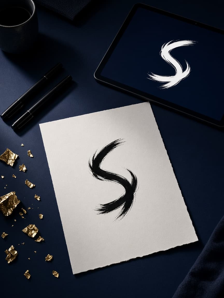
Logo Design
A logo has to survive at the size of a tab icon and at the size of a sign.
We design a mark that holds up in those conditions, in colour and in a single colour, on light and on dark.
Sketches come before polish, so you are choosing a direction rather than decorating a weak idea.
The files you receive are the ones a printer, a developer, and a social intern can actually use.
If the name is hard to read at small sizes, we solve that in the drawing, not with a drop shadow.
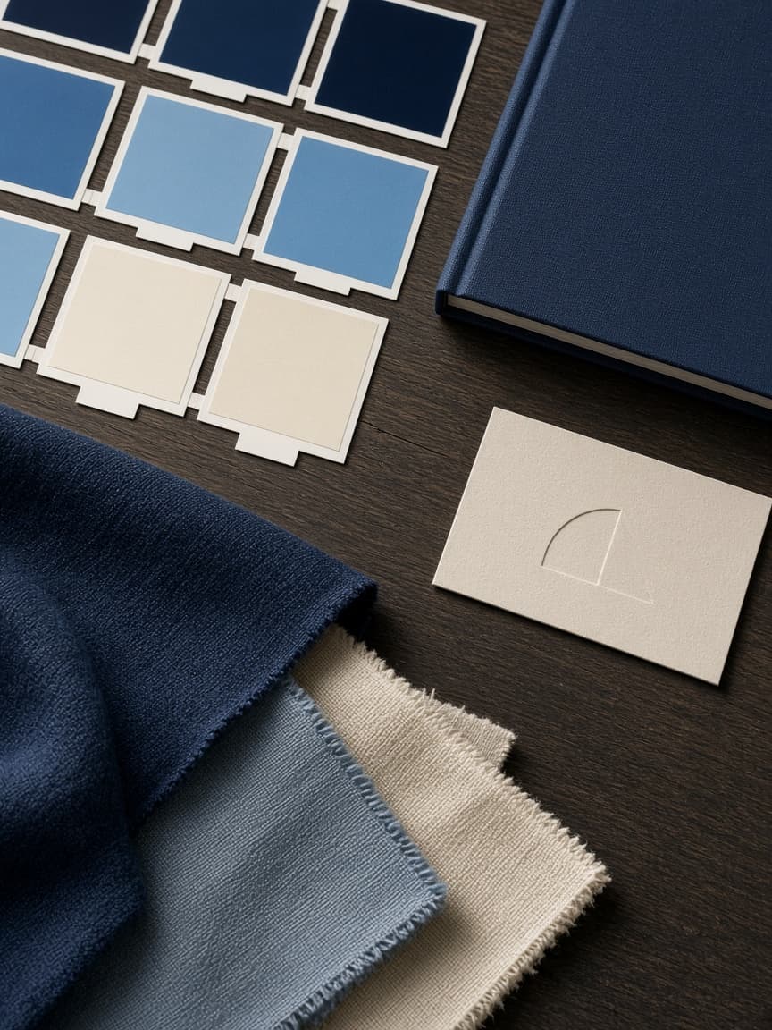
Brand Identity Design
A logo without a system is a sticker.
Identity design sets the colours, type, spacing, and graphic habits that make every later page look related.
We build a small, usable kit rather than a 90-page manifesto nobody opens.
The system is tested on a website header, a social post, and a document, because those are the places it will live.
When the identity is finished, a stranger should be able to tell your work from a neighbour’s without reading the name.
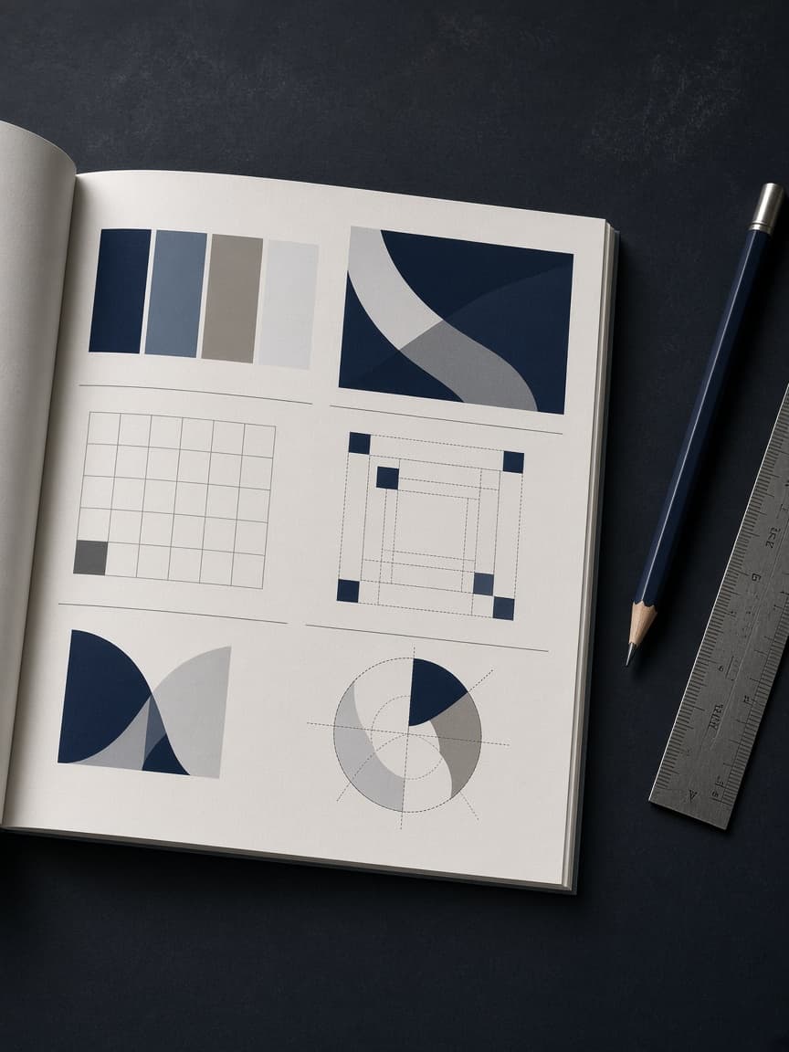
Brand Guidelines
Guidelines exist so other people can use the brand without inventing a new one.
We write a short, practical document covering the mark, colour, type, tone, and the mistakes to avoid.
Examples show the identity on a page, a post, and a slide, not only on a white artboard.
The file is written for a busy person, which means it can be followed in ten minutes.
When someone outside the studio produces a deck next month, it should still look like the same company.

Personal Branding
Founders, consultants, and specialists are often the product, whether they like that or not.
Personal branding gives that person a clear look, a clear line, and a set of materials that can be used on a site, a profile, and a talk.
We do not invent a personality.
We tighten the one that is already there so it is recognisable in a feed and in a room.
Photographs, type, colour, and the way the name is written are treated as one system.
The result should still feel like the person when they walk into a meeting.
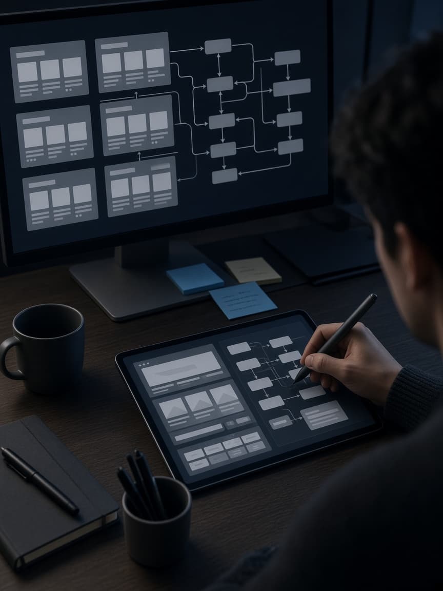
UI/UX Design
People abandon sites and apps that make them think too hard.
UI and UX work maps the job a user is trying to finish, then arranges screens so that job is obvious.
We wireframe the flows before decorating them, which is how you avoid painting a confused structure.
Buttons, forms, empty states, and error messages are designed as part of the same system.
You see the interface as a set of decisions, not as a mood board.
Development then has something precise to build.
Website Design
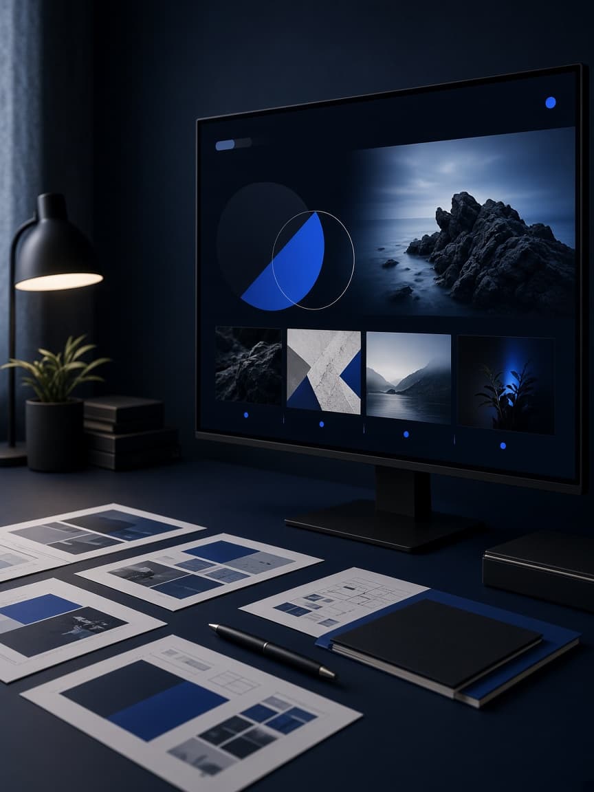
Website design is the look and the order of the pages a visitor will actually scroll.
We arrange each page so the offer is obvious within a few seconds, including on a phone.
Type, colour, imagery, and space come from the identity, so the site does not look like a theme with a logo dropped in.
Hierarchy is treated as a craft: what is first, what is proof, what is the next step.
The design is handed over in a state a developer can build without guessing.
App UI Design
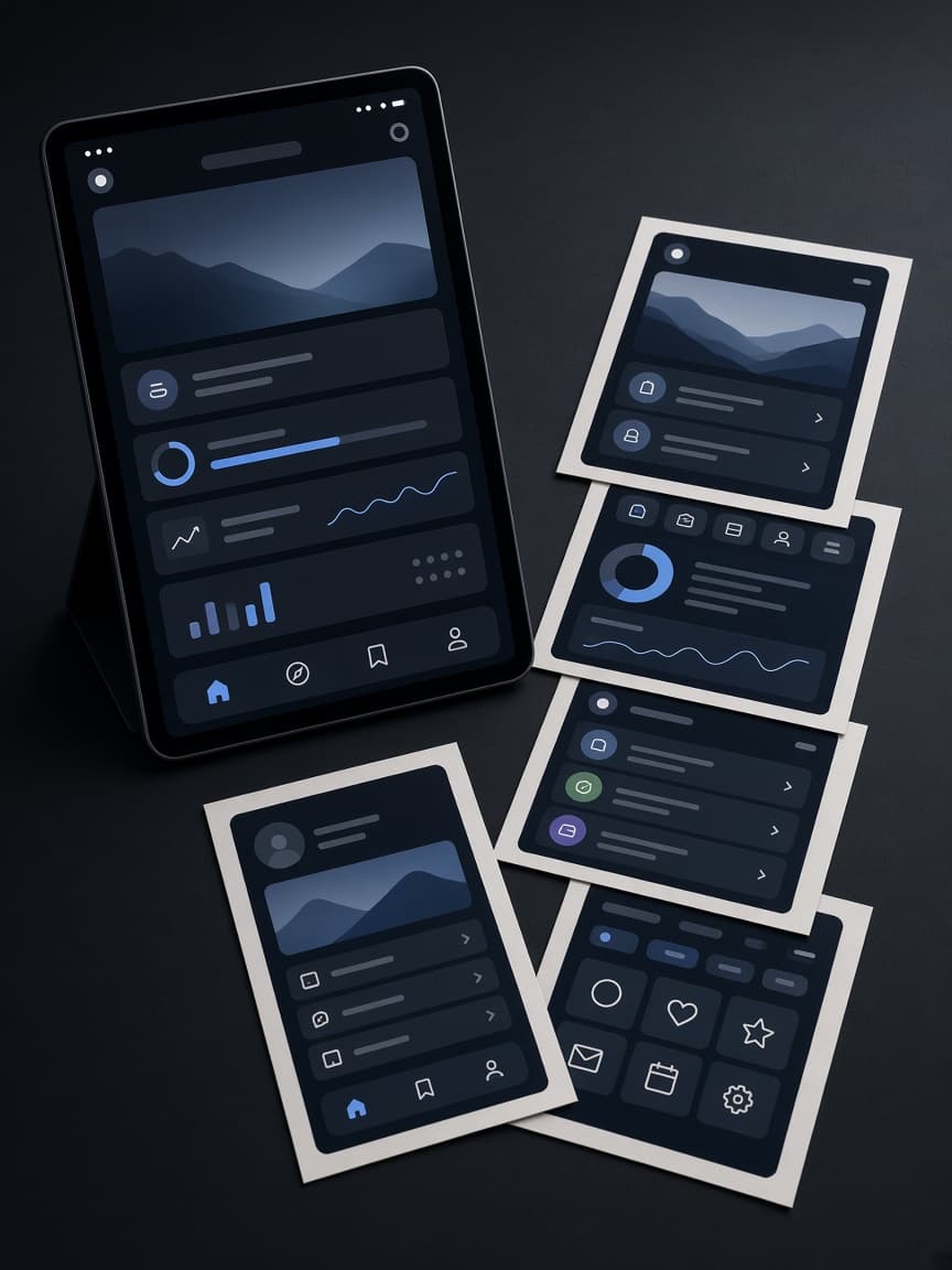
An app interface has less room than a website and less patience from the person holding it.
We design the screens around the actions that matter, with thumbs, one-handed use, and interrupted sessions in mind.
Components stay consistent so a user does not have to relearn the app on every page.
Empty states and errors are designed with the same care as the happy path.
The files a developer receives are specified, not merely pretty.
Social Media Post Design
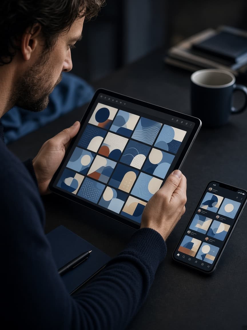
A post has about a second to look like it belongs to you.
We design templates and individual pieces sized for the feed they will run in, using the identity rather than a trend overlay.
Type is large enough to read with the sound off and the phone in a queue.
A set of posts should feel like a series, not like eight unrelated images.
When the campaign ends, you keep files you can adapt rather than a folder of locked pictures.
Marketing Creatives
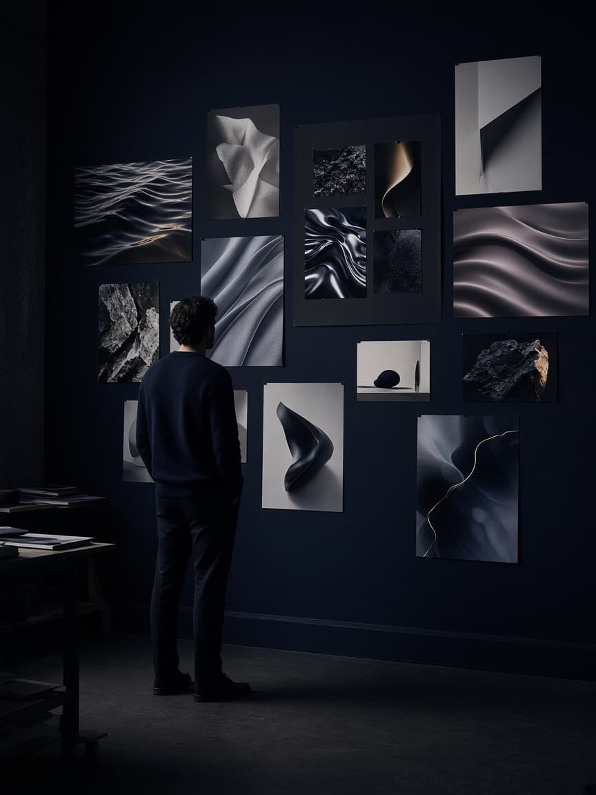
A campaign needs more than a logo on a rectangle.
We make the visual pieces the plan actually requires: posts, stories, covers, sales sheets, and the odd physical item if the brief calls for it.
Each piece is built from the same identity so the campaign looks considered instead of assembled.
Copy and design are handled together, because a beautiful layout with a weak line still fails.
You receive files ready for the placements you named, not a single master that does not fit any of them.
Banner & Ad Design
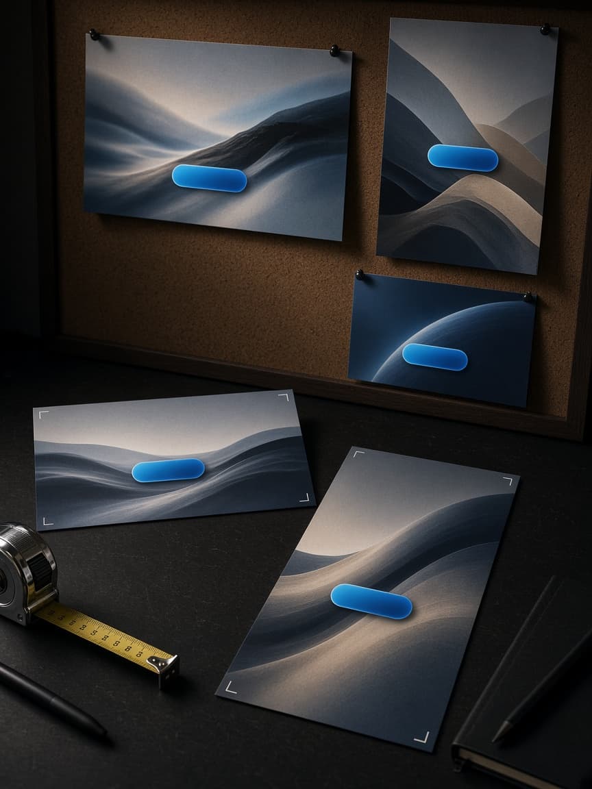
Ads are cropped, compressed, and ignored.
The design has to survive that.
We make banners and paid placements at the sizes the platform requires, with a focal point that still reads at a glance.
The offer and the brand are both visible; one should not erase the other.
Variations are produced when a campaign needs them, rather than stretching one layout across every slot.
What you get is ready to upload, not a concept that still needs a production pass.
Infographic Design
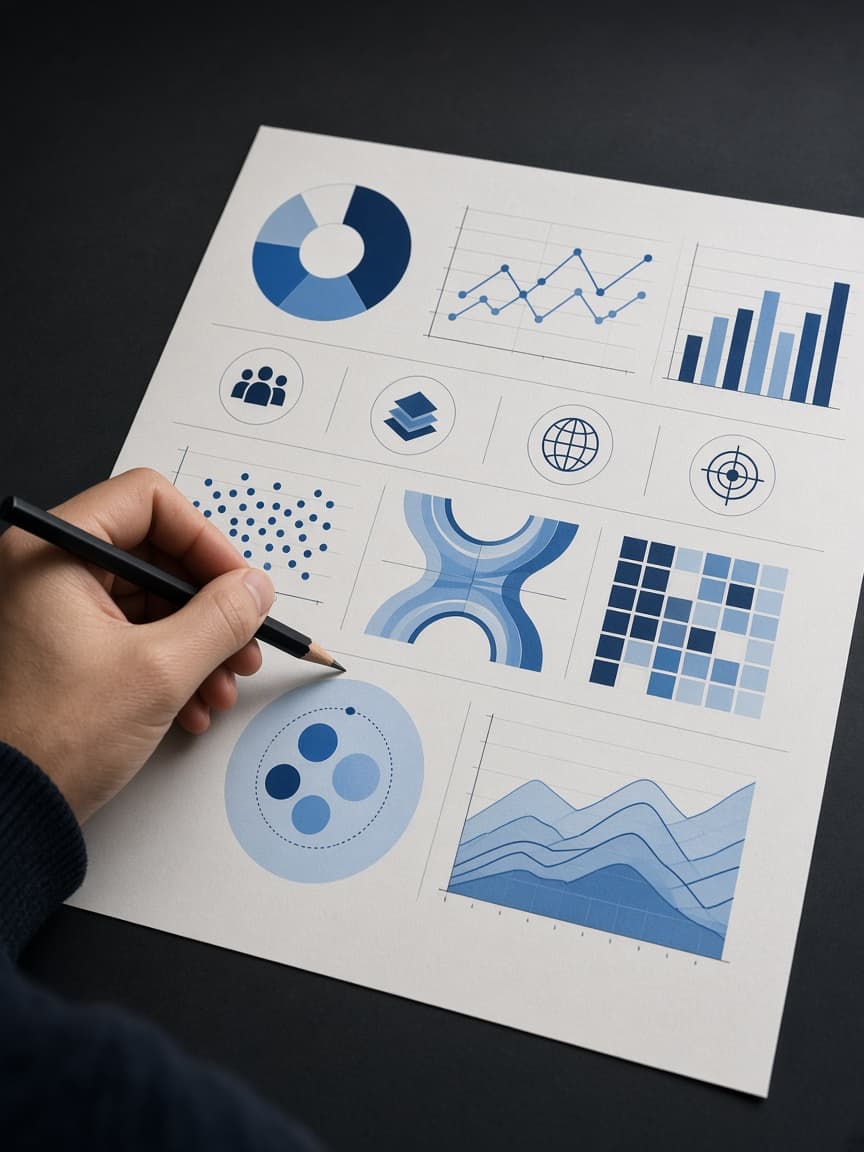
Some arguments are easier to see than to read.
An infographic turns a process, a comparison, or a set of figures into a picture a busy person can scan.
We start from the point you need to make, then give it a structure, not a decoration of icons.
Type, colour, and hierarchy follow the brand, so the piece can live on the site, in a deck, or in a post.
The finished file should still make sense if someone only looks at it for twenty seconds.
Pitch Deck & Presentation Design
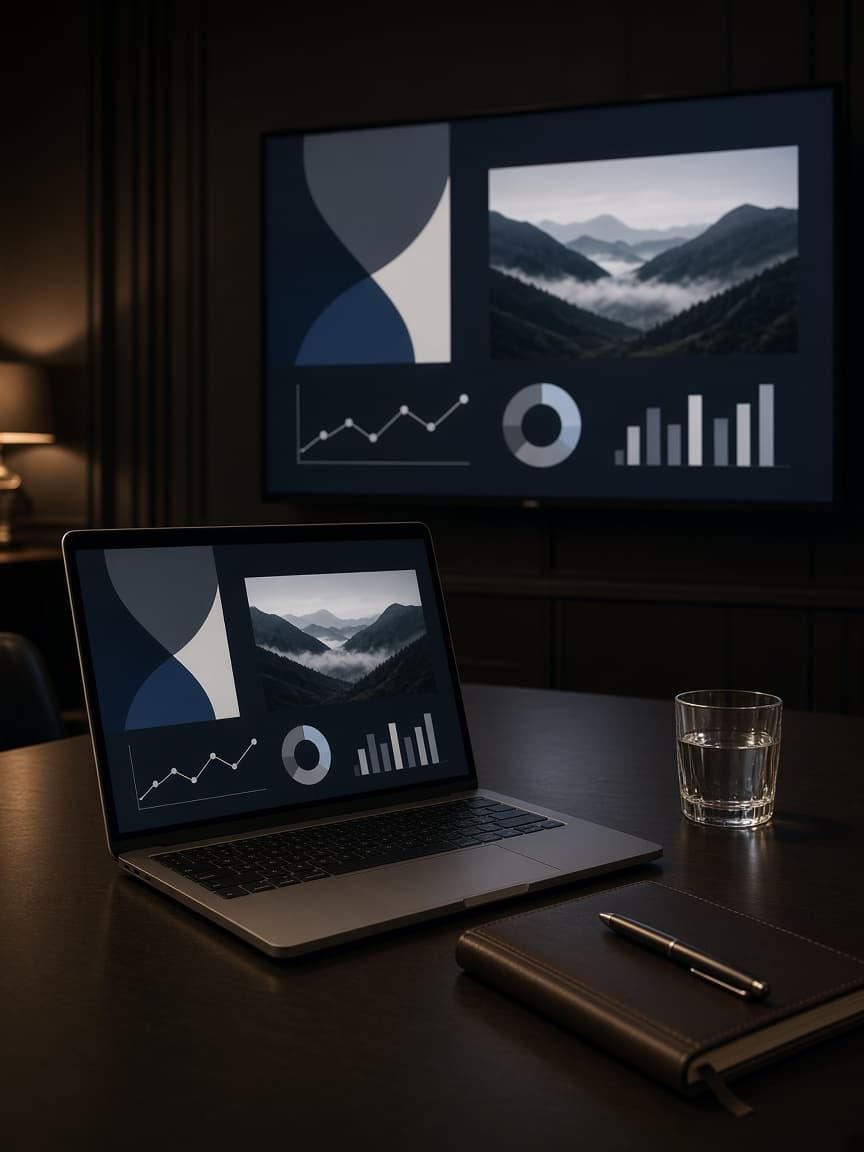
A deck is read in a room, on a laptop, and sometimes forwarded without you there to narrate it.
We design slides that stay readable at all three distances.
The story has an order: the problem, the offer, the proof, the ask.
Charts and screenshots are cleaned up so they support the point instead of filling space.
You leave with a file you can present this week and adapt next quarter without the design falling apart.
Related